How to Create a Standout Book Cover (For Beginners)

You’ve finished your book and it’s time to create a book cover.
The problem?
You have no idea what you’re doing. You’re a writer, not a graphic artist, and certainly not a book cover designer.
The other problem?
You don’t have a lot of money to spend on a book cover designer, either. And even if you did, you wouldn’t know how to go about finding one.
It sounds like you’re in the right place, then. In this post, I’m sharing my favorite strategies for a book cover that doesn’t look like PhotoShop amateur hour. You’ll learn how to create a book cover that will look good positioned right next to professional designs. You may not want to quit your job and become a book cover designer, but you will be proud of your work. Ready to get started? Let’s do it!
Here’s a list of best practices to keep in mind when DIYing your book cover. Subscribe to receive this extra resource.
Why a Standout Book Cover is Necessary in the First Place
We’ve all bought into the hype that you can’t judge a book by its cover.
While that may be true, the cover can definitely give the potential reader a powerful incentive to pick up your book. I’ve come across book covers that stopped me dead in my tracks and dared me to keep walking. Haven’t you? Isn’t that the kind of book cover you want for your book, too?
A book cover’s job isn’t to sell the book, it’s to get the book into the would be reader’s hands. Your words will sell the book-- whether that’s the book description on the back or the first words of chapter one. But, before they can get to your words, they’ve got to be compelled to pick up your book in the first place.
A good cover will do that.
So, how do you create a good cover?
Start with Your Genre
The genre of your book will have a lot to do with the cover you ultimately choose. For example, a romance novel will have a completely different look than a dystopian novel (at least, I hope).
Buyers who shop in certain genres have certain expectations for what the cover should look like. These are visual cues that help the buyer immediately identify your book visually as belonging to a certain category.
Because there are so many different genres, we can’t cover them all here in one post, but I highly recommend that you visit Amazon, Pinterest or your local bookstore and take a look at other books in your genre.
Make a note of consistent visual themes in the cover art:
What type of font is most frequently used? It is classical, embellished, straight, no frills?
What are the most used colors? Create a running tally of each to determine which colors are most popular. Is there a frequently used color combination?
What type of images are used? Photographs, drawings, photomanipulations?
Are there images of people or settings? If so, which is more prevalent?
Create a Mood Board
While you’re in research mode, I recommend creating a private board on Pinterest. Here, you’ll save (or pin) all of the book cover designs that inspire you the most. These images will serve as a muse to help you create your book cover design.
The more book covers you can pin here, the better. After you’ve pinned quite a few covers (50+), you’ll start to see trends. These trends will tell you what you like in book covers, which is important. Your personality and style should also be a part of the cover design.
Don’t be afraid to trust your instincts when it comes to book design.
Easy-to-Read Font
There are two ways to decide on fonts for your book cover. You can choose one for completely utilitarian purposes: the font you choose is unassuming and used mostly to identify you and your book. It’s not there to be the star of the show.
On the other hand, you can fully incorporate the font into the design of your book cover, like so:
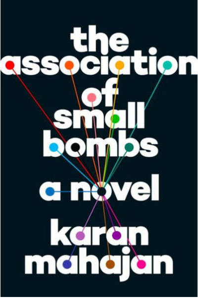
The Association of Small Bombs, Cover Designed by Matt Vee
This font is integral into the design of the book cover. While this type of design can be more abstract than an image-based cover, it also has the power to be just as visually dynamic.
Always remember to skew towards readability. Don’t sacrifice decipherability no matter what.
Here are a two extra resources you may want to check out to help you choose the right font for your book cover:
- 300+ Fool-Proof Fonts to use for your Book Cover Design (an epic list of best fonts per genre)
- 5 Great Fonts for Book Covers
Remember Your Colors
Ah, color selection. It’s quite possibly the hardest part of creating a non-amateurish book cover. If you choose too many colors, your book cover will look garish (at best), but if you don’t choose enough or the right type of colors, your cover may be too boring to approach.
So, why are colors so crucial?
Color conveys emotion and can quickly communicate a message to the potential reader. Color also has the power to draw the eye, so you want to choose one or more that stands out.
Does that mean you should go for all red because it’s a show-stopper? Not necessarily.
Instead, think in pairs. Many professional book cover designer go a complementary color combination, such as blue and orange. Complementary colors are opposite each other on the color wheel and often convey a sense of energy and movement that beckons the eye.
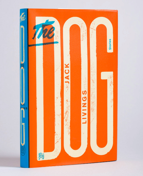
The Dog: Stories by Jack Livings
Keep It Simple
Simplicity is always best.
Even though the human brain is able to process visuals 60,000 faster than text, you still don’t need to overload the book cover with too much content. There shouldn’t be too much going on in the background, too many colors fighting with each other or too many font types jockeying for position. That’s the quickest way to ensure that no one even picks up your book to begin with.
Use High-Quality Stock
Whether you’re using photographs or graphic elements, you’re going to need a high-quality stock library. Sure, you can pay for stock, but it can be cost-prohibitive, especially on your budget.
If you’re looking for cheaper (as in free or nearly free) alternatives, check out these resources:
It Needs to Look Good in Thumbnail
This is my final tip and it’s a big one. In fact, all of the above tips have lead to this moment: Your book needs to look killer in a thumbnail.
This is why simplicity is key. A person should be stopped by your book cover design in mid-scroll. Their eyes should be magnetically drawn to your book.
In order to achieve this, you need to make sure that your design is understandable even when a 10th of its size. So, before you go with your design, be sure to resize it down to see if it still looks good as a thumbnail.
Extra Resource
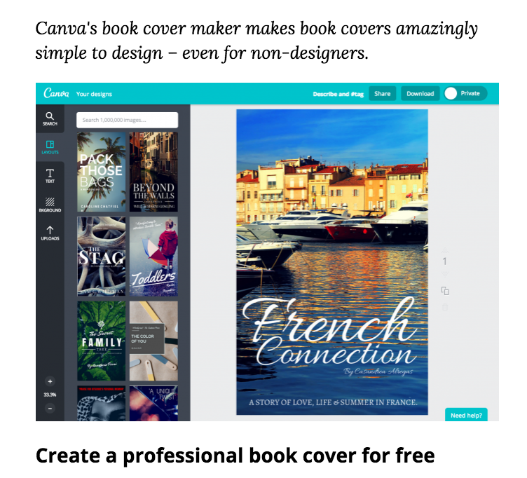
Before you go, here is my absolutely tool you can use to create an awesome book cover:
- Canva - It’s free and you can come away with a stunning book cover.
Here’s a list of best practices to keep in mind when DIYing your book cover. Subscribe to receive this extra resource.


